
 Bravo Fleet


To all the members of Bravo Fleet:
As part of our fleet rebranding, the task force logos have also been at the top of our list. They have largely gone unchanged since their current inception which has been well over ten years. I will also explain some changelog thoughts with each one!
TASK FORCE 9
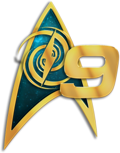
This one is pretty self-explanatory. 9 is keeping its iconic cyan-like blue color, but the logo in the center has changed to something more 9-centric: the Bajoran Wormhole!
TASK FORCE 38
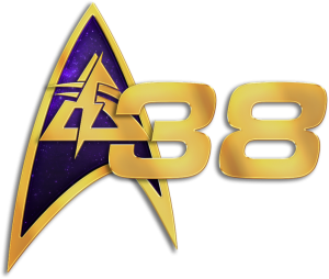
Task Force 38 keeps its purple color! The Greek delta logo has changed, though. The lowercase Greek letter was simply too “fat” to fit into the new Bravo Fleet logo correctly. The solution was straight-forward: use the uppercase delta letter!
TASK FORCE 64
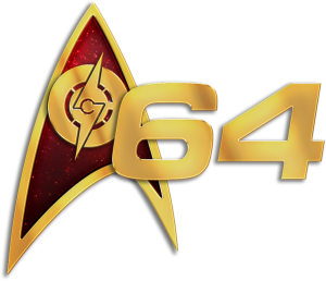
This one was probably the logo that saw the most change and was a bit tricky to work with. A few concepts were drawn up that changed the inside logo to laurels and other imagery. However, with a 64 “rebranding” of sorts coming soon (more on that once Domingo returns from STLV!) we wanted some imagery that really conveyed what 64 is all about. The logo color was also changed to red for the simple fact that the gold coloring did not work well with the gold accent of the new logo. It was very much a pain in the ole’ eyeballs.
TASK FORCE 72

Very little change here. 72 has barely changed in 20 years. Continue on with your sexy logo, 72!
TASK FORCE 93
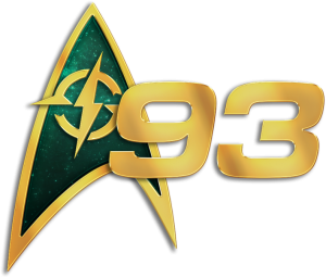
This is the other logo that, along with 64, got quite a bit of change. The first was the color. With 9 and 72 occupying a lot of the blue spectrum, 93s “greyish blue” was hard to accommodate. To set it apart and on its own, it has been given a more emerald green. To mix with 72, you get some very Earthish colors. It’s also a reminder that those sneaky Romulans are right around 93s corner! The sextant that originally occupied the 93 logo was also changed for similar reasons to 38: it was too “fat” to sit in the current logo properly. 93 has instead been given the replacement of a compass, which is the most fitting logo 93 could have.
TASK FORCE 99
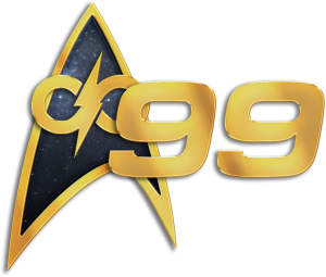
Just as with 72, 99s logo remains largely unchanged. Black, infinity, infinite possibilities. Go 99!
